Lead Content Designer on Instagram Reels Engagement
Project specifics available upon request.
Lead Content Designer on Facebook’s Communities Product Group
Project specifics available upon request.
Lead Content Design POC during rollout of Messenger Rooms across the Meta family of apps and Reels creation team.
Working across all merchant, shopper and consumer products, I built up Instacart’s first-ever UX Writing/Content Design discipline with original content standards and quality controls as well as XFN collaboration models and hiring resources.
I also bridged the gap between Marketing/Comms teams to align with Instacart’s evolving business strategy and refine the brand and product experience in lockstep through language exercises ranging from the implementation of a new brand voice to the company mission statement.
While working across web and mobile experiences, I established WeWork’s original UX Writing/Content Design practice through comprehensive audits that helped inform bespoke style guides, content guidelines and resources that prepared the company for rapid expansion.
Sitting at the center of language efforts, I also linked cross-functional partners across internal marketing and external creative agencies to establish a cohesive linguistic style across product, corporate communications, and global marketing.
As the world’s most trusted option in the industry for buying and selling authentic sneakers, GOAT required a robust plan for delivering accurate and comprehensive backgrounds for each of over 42,000 SKUs.
Having an innate affinity for footwear, I first helped define distinguishing markers for everything from general releases to rare exclusives through meticulous research. With a combination of fact checking and old-fashioned street smarts, I continue to help establish GOAT as the web’s go-to source by tracing sneaker lineages and creating concise yet compelling narratives that tell each pair’s unique story.
The comprehensive sneaker stories were then paired with minimalistic navigation copy, product nomenclature, and a straightforward UI. The subsequent user payment flow and authentication process are equally trim to facilitate easy checkout, and are supported by notification and email communications to keep users updated every step of the way.
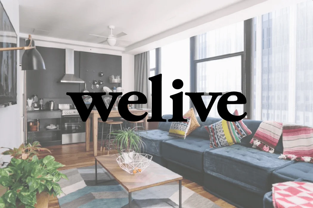
As We Company’s dominating presence in the flexible workstation experience transcended the residential industry, so did the need for an all-new brand voice and human-centered booking experience that gave independence to the WeLive platform while staying true to its community-inspired roots.
Working in tandem with the design and management team at Doubleday & Cartwright, I was able to recognize solutions for some of the problems associated with the notion of cohabitation while simultaneously defining an entirely new style of neighborhood for today’s urban dwellers. The result is a complete overhaul of the club’s web copy and booking engine, targeted for a modern audience who values community as much as privacy, adventure as much as employment, and a unique style of collaborative coexistence.
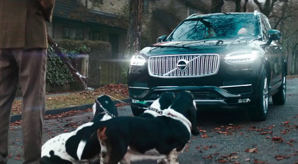
Commercial Treatment by Troy Turner (Download here.)
Client: VOLVO
Direction: Dorian & Daniel
Production: RESET
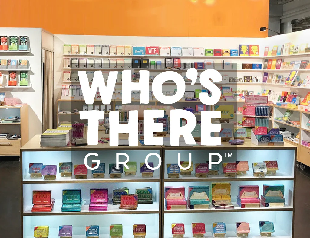
Under the Who’s There Group umbrella, Emily McDowell Studio is a maker of illustrated greeting cards and gifts for the relationships we really have found in retailers from Barnes & Noble to World Market. As the Lead Marketing Writer for EMS and two other brands I executed the following:
• Creative direction of marketing initiatives for 3 brands
• DTC: copy and creative for integrated digital, label, email, social ads, POP, and print
• B2B: copy and creative for wholesale web, mailers, trade show, and multi-season catalogs
As the agency’s Senior Copywriter, I worked alongside a small but mighty team of creative technologists with whom I shared a passion for the power of digital media. I continue to work with the ‘Farm on a freelance basis for their roster of entertainment clients.
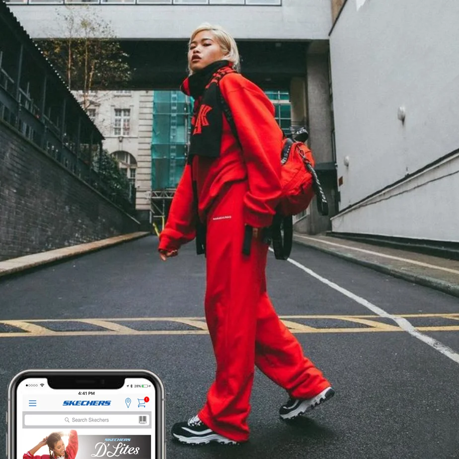
Clients: NBC Universal, Skechers, Ubisoft, Paramount Pictures, Panasonic, UCLA, Warner Brothers, ETC Hotels, FX Network, Air Tahiti, Tahiti.com, 20th Century Fox
• Origin and ongoing branding exploration for language, tone, and DTC messaging
• Copy for web, microsites, social channels, newsletters, print, and ad units
• Social copy strategy for large-scale entertainment, product, and service campaigns resulting in upwards of 15 million impressions
• Post campaign analysis based on response results and subsequent strategic recommendations for future process improvements
• Development and oversight of regimented internship program
Following the notable revamp of Tahiti.com, the region’s premier travel partner, Air Tahiti Nui, reached out for a similar refresh that would entice visitors through enhanced visuals and storytelling.
The new site makes it easy for travelers to buy air packages and set up travel, distinguished the carrier as a trusted authority on the destination. The remixed site is truly a reflection of the travel service’s knowledge and prestige.
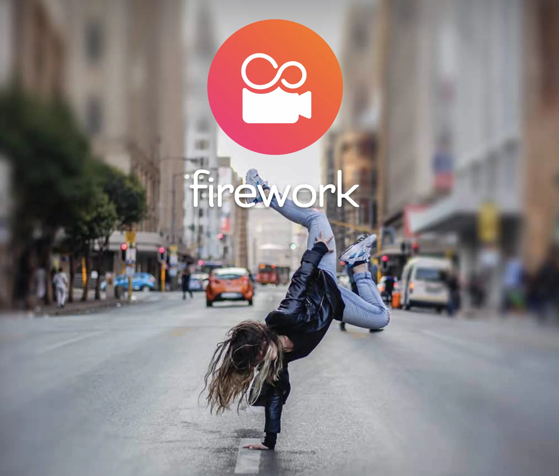
Collaborating with the creative team at Doubleday & Cartwright, I developed original copy as part of an extensive rebranding for Firework — a viral application that’s been dubbed “Vine but better.” From tagline explorations to in-app CTAs, we were able to reposition Firework as not just robust editing software but a powerful social community that connects talented creators and passionate fans.
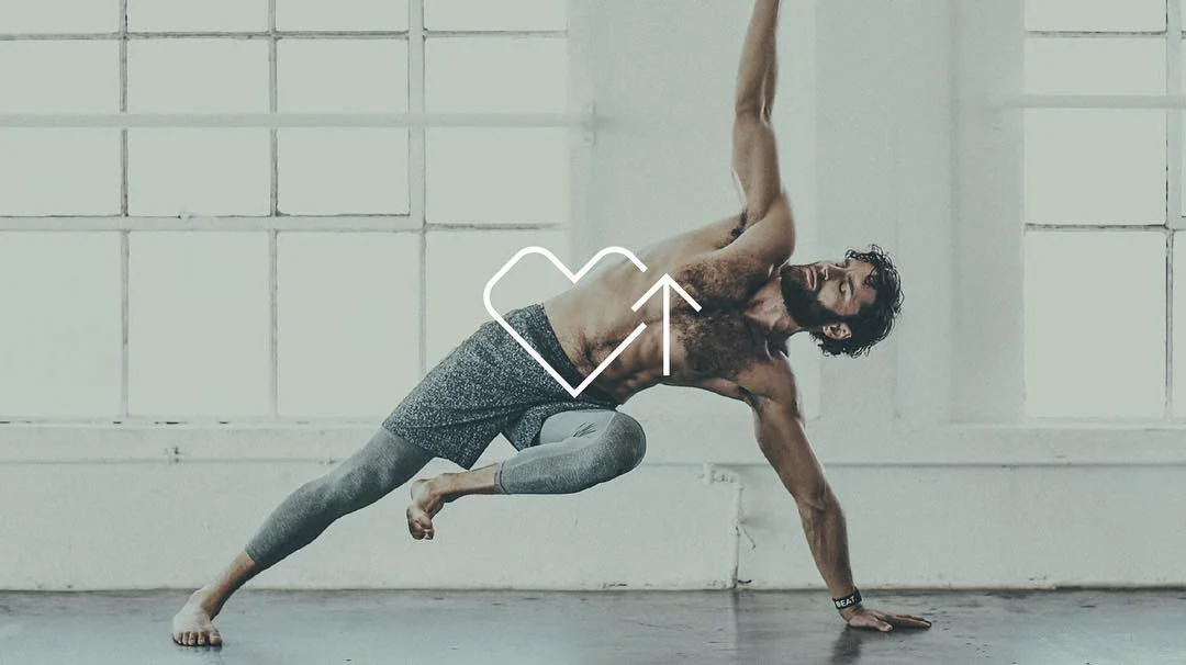
WHOOP’s rebranding as a subscription-based service required all new language to accompany an all new look and user interface.
After a deep dive into keyword research and interviews with professional athletes, I developed an all new tone and textual style to transform the brand from a scientific product solely for the pros into an amped-up, fitness-focused must-have for everyone from Crossfit freaks to gym rats.
Incorporating idiomatic phrases and punchy copy elevated the excitement of the product while simpler scientific explanations drove home the benefits of the new membership platform.
A resource for the ultimate travel destination should capture the essence of the ultimate travel experience. The goal was to blend ideals of an epic getaway, honeymoon, or once in a lifetime opportunity with aspects of a trusty guidebook. Alongside stunning visual imagery, playful copy with just the right amount of edge crafts a modern identity that feels genuine and approachable yet entirely exclusive.
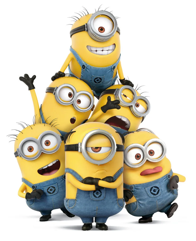
Minions tells the story of the lovable yellow creatures’ laughable quest to find the most despicable master. To promote the summer release of the blockbuster film, Universal Pictures set out on a quest to find out which NBCU star needs the Minions the most. Enlisting partners from across NBCU companies, 24 personalities and characters ranging from a Real Housewife to Jaws competed to win the Minions.
Fans could vote for their favorite celebrity by going to the Minions Quest hub site and/or tweeting with a designated hashtag for which we helped craft. The site featured statements from each star of why they needed Minions and what their Minions would do. Along with the robust microsite, photos and clever copy were seeded in each of the celebs social media channels to get out the vote, resulting in 110k votes and over 60 million Twitter impressions.
Deliverable:
• Collaboration with creative team to strategize content for microsite, social platforms, and coordination with affiliate partners
• Development of on-brand copy for web, navigation, social messaging, and marketing promotions
• Partnership with UX team to define user models and interfaces for features
• Participation in usability reviews of site designs to refine content, navigation, and functionality
• Content compliance with corporate standards, web style guides, and legal
Beginning with the classic Shape-Up, Skechers has developed an extensive line of fitness shoes which is still growing. To help prospective buyers, I helped lay the foundation for their Facebook app, the Fitness Shoe Finder, in order to help customers figure out which fitness shoe is right for them.
Users answer a series of questions about their needs and lifestyle. As each question is answered, a grid of 30 shoes is gradually filtered down to just a few select recommendations. The user can then view details of the recommended styles and share their results or shop in the Skechers online store. The result is eye candy that is also totally functional - just like Skechers fitness shoes.
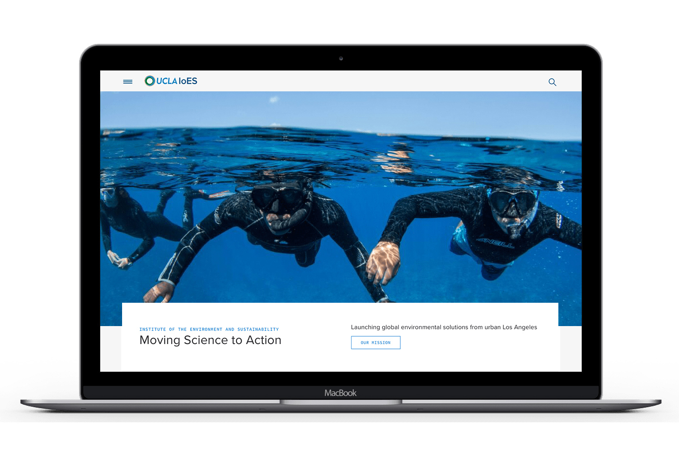
IOES
The Institute for Environment and Sustainability, a global leader in the environmental movement, is comprised of academic programs, research centers, and thought leaders.
The institute needed a robust web platform to represent the wide range of work to a diverse audience.
Working closely with a broad range of users, from students, to educators, to administrators, the challenge was to lay an editorial foundation from which to grow so that each user might achieve their unique goal. A visual magazine anchors the editorial aspect of the site and highlights the program mission.
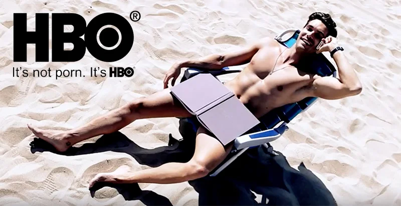
Commercial Treatment by Troy Turner (Download here.)
Client: HBO
Direction: Alberto Belli
Production: Alberto Belli
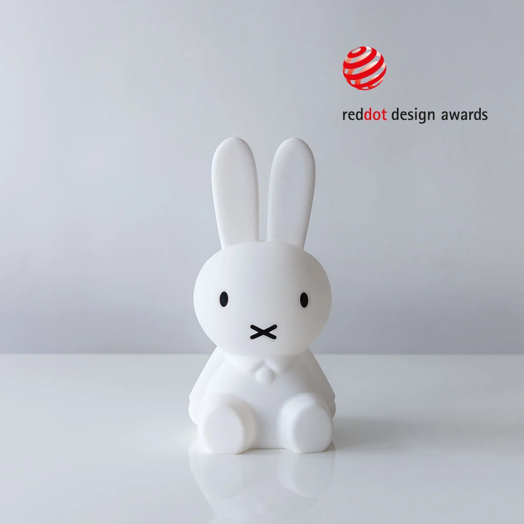
With over 5 million unique visitors per month, YD is the world’s leading online magazine (and a social titan) dedicated to covering the best in international product design.
As the Senior Editor for nearly 9 years, I have authored over 7,000 original articles ranging from motorcycle reviews to critiques on conceptual coffee makers and much more. Name a product type and I’ve created a clever title and original copy for it... dozens of times. Many have resulted in millions of permalink hits and social shares.
I also work closely with YD’s international team to help evolve our social channels, visual presence, content types, and editorial voice based on trends and analytics.
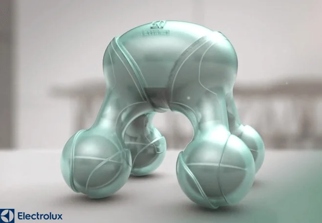
I also lead production teams to cover global design events including the Red Dot Product Design Awards in Germany and annual Electrolux Design Lab in cities like London, Stockholm and Paris.
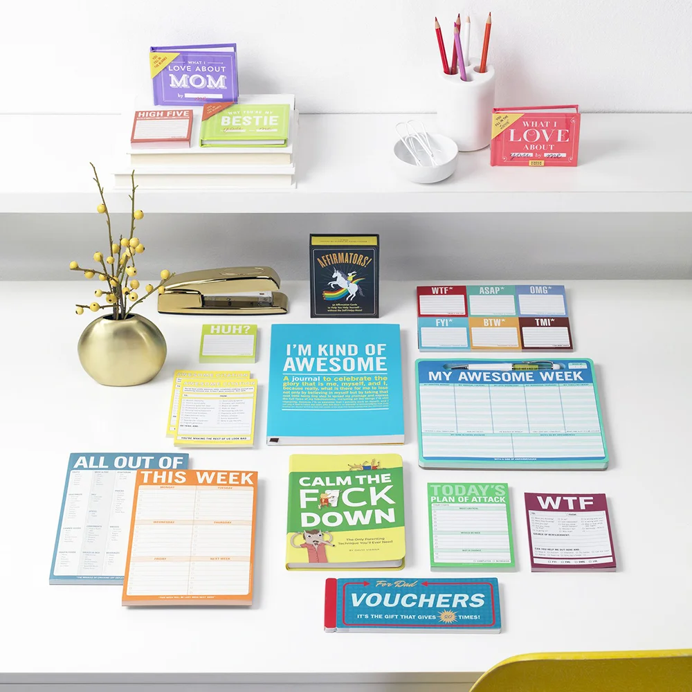
Under the Who’s There Group umbrella, Knock Knock is an independent makers of clever gifts, books, stationery, desk & office stuff. Varied collections aim to bring humor, creativity, and smarts to everyday life. As part of the greater marketing team and the brand’s Lead Marketing Copywriter, I executed the following:
• Creative direction of marketing initiatives for 3 brands
• DTC: copy and creative for integrated digital, label, email, social ads, POP, and print
• B2B: copy and creative for wholesale web, mailers, trade show, and multi-season catalogs
Coming soon.
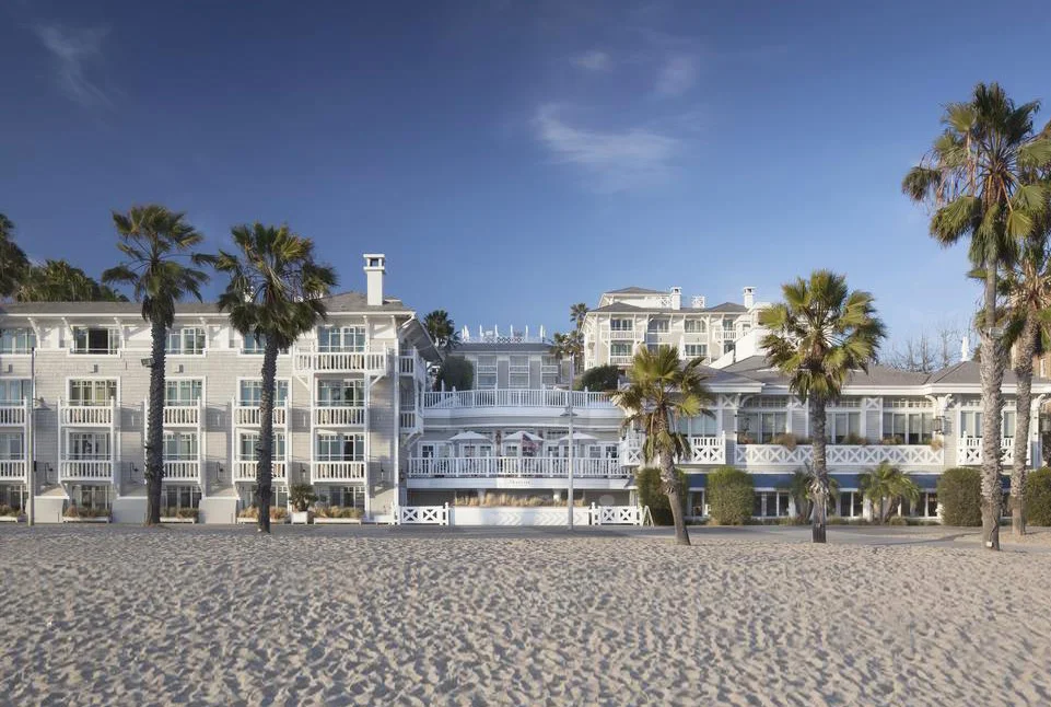
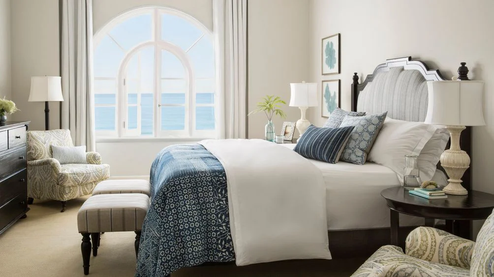
Both Shutters on the Beach and Hotel Casa Del Mar are known destinations for travelers and locals alike, so ETC Hotels requested a modern website experience for both properties that not only showcases the new look of Hotel Casa Del Mar, but also inspires visitors and neighbors to book a room or reserve a table by the sea.
Copy focused on coastal luxury unifies the sites while distinct changes in tone allow for the unique personalities of the two properties to be illuminated. High search ranking is the key to success for hotel sites, so every word, sentence, and phrase has been thoughtfully chosen from strategic keyword research to help SEO without disrupting vibe.
Under the Who’s There Group umbrella, People, Places, & Things is a unique collection of modern gifts and designs to celebrate the people, places and things that connect us. As the brand’s dedicated Marketing Writer, I executed the following:
• Creative direction of marketing initiatives for 3 brands
• DTC: copy and creative for integrated digital, label, email, social ads, POP, and print
• B2B: copy and creative for wholesale web, mailers, trade show, and multi-season catalogs
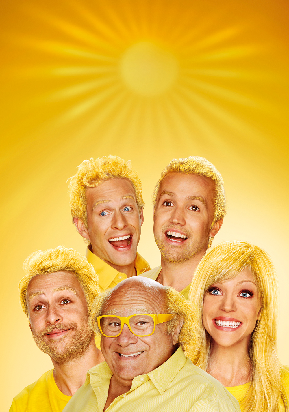
Clever copy in line with the show’s twisted humor is splashed across Always Sunny in Philadelphia rich media banners for the Season 4 release. To make the banners more dynamic, we incorporated this little-known-thing called Twitter and streamed live tweets using #sunnyfx.
Knowing the show, and knowing the risky business of live, crowd-sourced content, I had to help create a custom profanity filter for the stream. The flash banners were a hub for Always Sunny MP3s, wallpaper downloads and video clips, and captured the show's downright hilarious vibe.
Deliverable:
• Collaboration with creative team to strategize content for microsite and social platforms
• Development of on-brand copy for web, navigation, social messaging, marketing promotions
• Partnership with UX team to define user models and interfaces for features
• Participation in usability reviews of site designs to refine content, navigation, and functionality
• Content compliance with corporate standards, web style guides, and legal
I was catching up with an old friend who started bragging about planning an elaborate Greek vacation. I was so proud of this small town bumpkin who’d never left the country until I found out they had knocked off the idea from the Kardashians. - Insert eye roll. - However, they gave ME the best idea EVER: a website for fans of reality TV shows to find places they’ve seen on their favorite shows.
For two years my friend and I poured our hearts, souls (and wallets!) into the design and development of Taste of Reality. Less than a year after launch, we have an enormous database of thousands of filming locations that have caught the attention of network producers and fans alike.
The original site told fans what location or business appeared on what show, in which season and episode, in addition to giving them a witty reminder of what happened there. Today, Taste of Reality evolved beyond the locations to include fun lists, gossip, fashion, curated tours with a comedic twist, and even a successful podcast hosted by yours truly.
In addition to being a familiar face on the site, I serve as the chief creative officer, leading a team of writers, designers, and social gurus to produce original content in multiple formats, garnering hundreds of thousands of impressions and page views every month.
Building off the Fifty Shades of Grey Internship Program, Universal Pictures hired my team at The Branding Farm to create a new mobile-focused web experience for Fifty Shades Darker. Copy with a subliminal, sexy edge was crafted to takes fans inside Anastasia Steele's working world at Seattle Independent Press (SIP).
By completing tasks related to the literary world and the film, fans earned badges and rewards such as exclusive photos, gifs and behind-the-scenes videos.
Deliverable:
• Collaboration with creative team to strategize content for microsite and social platforms
• Development of on-brand copy for web, navigation, social messaging, and marketing promotions
• Partnership with UX team to define user models and interfaces for features
• Participation in usability reviews of site designs to refine content, navigation, and functionality
• Content compliance with corporate standards, web style guides, and legal
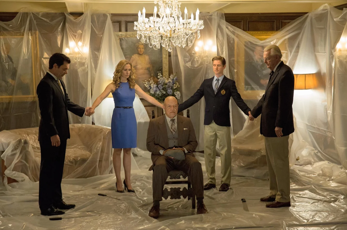
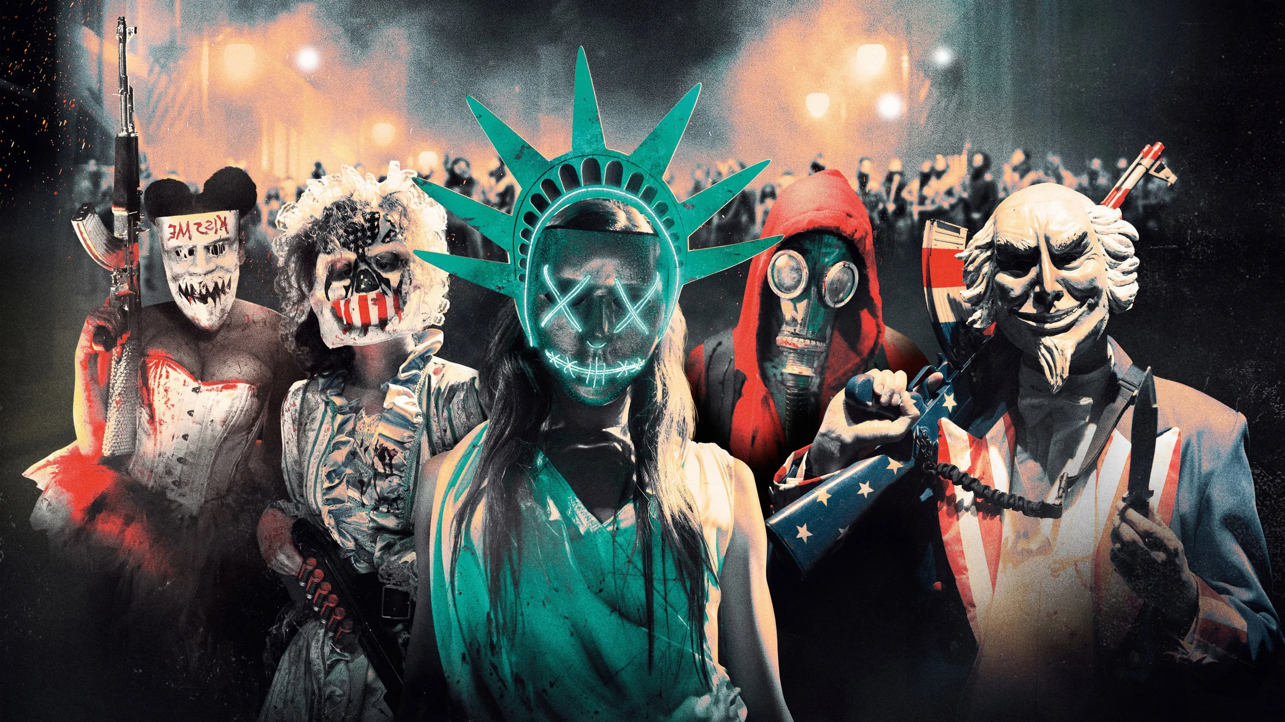
Through aggressive, on-brand copy and design, we delivered an in-world storytelling experience for Universal Picture’s cultish motion picture franchise. For the third and final installment in the franchise, we extended the presedential election storyline by updating the NFFA site used in previous Purge campaigns to a slick party and candidate platform site leveraging some real world 2016 election year events.
Deliverable:
• Collaboration with creative team to strategize content for microsite and social platforms
• Development of on-brand copy for web, navigation, social messaging, and marketing promotions
• Partnership with UX team to define user models and interfaces for features
• Participation in usability reviews of site designs to refine content, navigation, and functionality
• Content compliance with corporate standards, web style guides, and legal
Commercial Treatment by Troy Turner (Download here.)
Client: General Mills
Direction: Matt Smukler
Production: Community Films
The Who’s There Group umbrella consists of three female-owned businesses, including:
Knock Knock – independent makers of clever gifts, books, stationery, desk and office stuff. Varied collections aim to bring humor, creativity, and smarts to everyday life. Available at retailers such as Urban Outfitters and Target.
Emily McDowell Studio – maker of illustrated greeting cards and gifts for the relationships we really have. EMS is found in retailers from Barnes & Noble to World Market.
People, Places & Things – a unique collection of modern gifts and designs to celebrate the people, places and things that connect us.
As a leader of the greater marketing team and the sole Marketing Copywriter for all three brands, I executed the following:
• Creative direction of marketing initiatives for 3 brands
• DTC: copy and creative for integrated digital, label, email, social ads, POP, and print
• B2B: copy and creative for wholesale web, mailers, trade show, and multi-season catalogs
For the program’s duration, I served as the primary media representative for Electrolux Design Lab, a months-long competition in which industrial design students from around the world competed in an ExFactor-style challenge for the best themed product design. From simple biographies to final product critiques, I helped the design community stay connected to the event through each phase, including acting as a special guest commentator and Yanko Design brand ambassador during live finales taking place in Paris, London, and Stockholm.
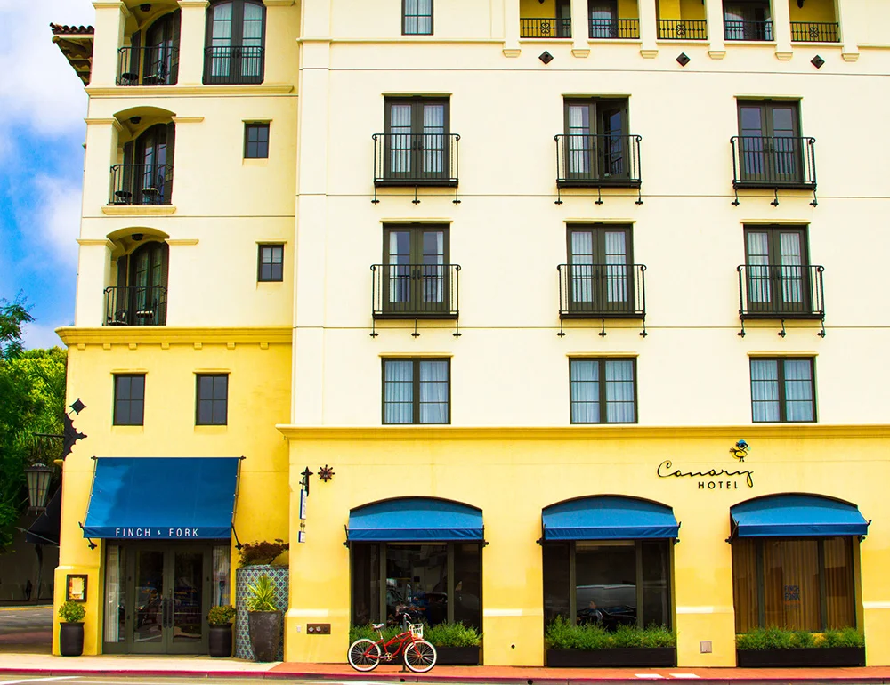
Canary hotel was due for the update it deserved. Working in tandem with our internal creative team, I knew the general design would need to be complemented by a distinctive language style to convey the notion of casual luxury. The design is flexible between different browsers, devices, and screen resolutions to showcase the beauty of the various properties and their surroundings. As such, the copy had to deliver a complete yet concise message with optimization for travel searchers. The resulting copy, like the hotel, exudes understated elegance.
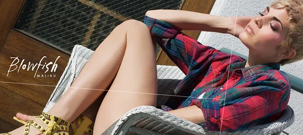
Budding shoe giant, Blowfish Malibu, had a goal to redefine their voice, aesthetic, and overall identity. I answered with a fresh new tone and style to accompany their revamped new look.
Starting with brand discovery and lots of field research, we re-acquainted Blowfish with their true customer base.
Next we created consistent look, feel and brand messaging through all the company's creative outlets. We produced their lifestyle photoshoots, letting the new Blowfish girl really come into her own. Using insights from real Blowfish girls and aligning their voice with the goals of the company, we set out to build a CMS controlled, fully-optimized e-commerce site. The all new Blowfishshoes.com begins with a fun flash sequence with stop motion photo sequences. The site features Facebook integrated shopping tools, where users can share product and see what other products their friends are into. The shopping experience is easy and fluid. There's quickshop functionality, multiple views and a product zoom.
The icing on the cake is an email marketing campaign we've designed to mimic the look and feel of the site and offer Blowfish's Studio B members deals they can't get anywhere else.
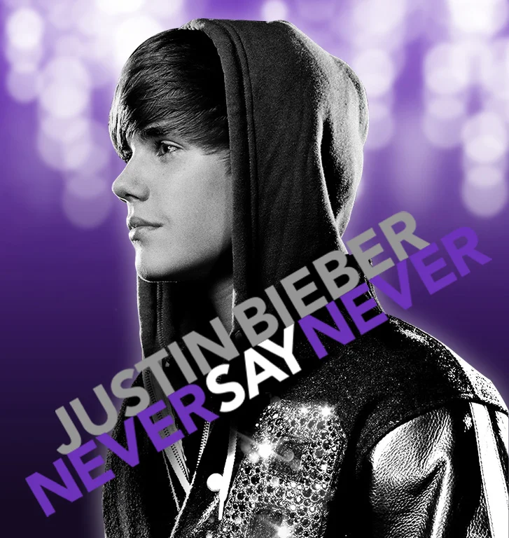
Ever heard of Justin Bieber? I thought so. For his movie release campaign, my team leveraged his 10 million Twitter followers and 25 million FB fans, and created a psuedo-holiday surrounding the movie release. The campaign was crowned #NSNWeekend - complete with exclusive party favors the week prior to release.
We created a countdown to NSN Weekend to hype the release and our microsite featured a ticking clock that prompted users to login via Facebook and RSVP to a global viewing event or create their own viewing party events via the Facebook API.
Every day, we unlocked exclusive party favors ranging from Bieber-Berry Cupcake recipes to life-sized posters of Justin, Chrome themes, concert clips and more. A secondary Facebook app called Pic Me JB had roughly 3,000 people a day show Justin some love by putting him in their profile pic.
Deliverable:
• Collaboration with creative team to strategize content for microsite and social platforms
• Development of on-brand copy for web, navigation, social messaging, and marketing promotions
• Partnership with UX team to define user models and interfaces for features
• Participation in usability reviews of site designs to refine content, navigation, and functionality
• Content compliance with corporate standards, web style guides, and legal
On behalf of Yanko Design, I am a regular brand ambassador and reporter for the Red Dot Design Awards and a regular critic on the Red Dot Concept Awards. I have been honored to build relationships with renowned industrial designers such as Ken Okuyama, Hideshi Hamaguchi, Dr. Florian Hufnagl, and Wolfgang K. Meyer-Hayoz, helping share their unique perspectives to millions of followers around the world.
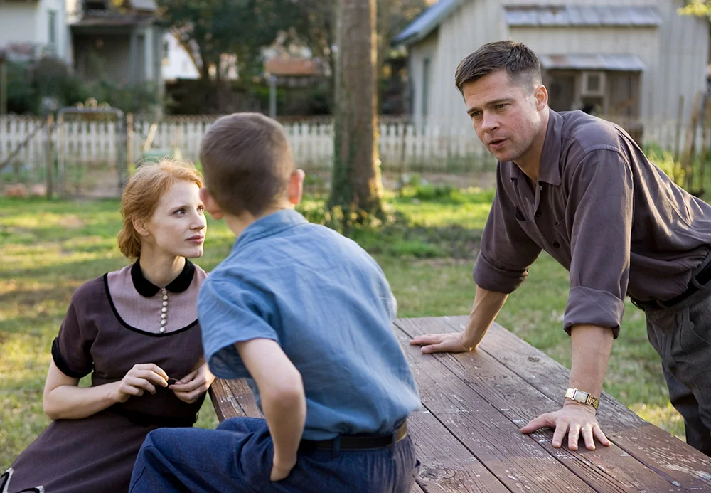
As a big Terrence Malick fan, I was deeply moved and inspired by Tree of Life. The film is a visual treasure that encompasses the human spirit. Without the distraction of superfluous verbiage, I wanted the agency’s promotional banners to capture the film's rapturous beauty and humility.
In order to evoke the film’s fragmented nonlinear narrative, the banners faded in and out of stills and clips from the film. The beautiful imagery of the origins of the universe and everyday life from the film is complemented by restrained messaging encouraging viewers to explore the film’s purpose, cast interviews, movie clips, and ways to purchase the film.
If you haven't seen the Tree of Life yet, please do. No more Internet. Go watch it. Go.
Deliverable:
• Collaboration with creative team to strategize content for microsite and social platforms
• Development of on-brand copy for web, navigation, social messaging, and marketing promotions
• Partnership with UX team to define user models and interfaces for features
• Participation in usability reviews of site designs to refine content, navigation, and functionality
• Content compliance with corporate standards, web style guides, and legal
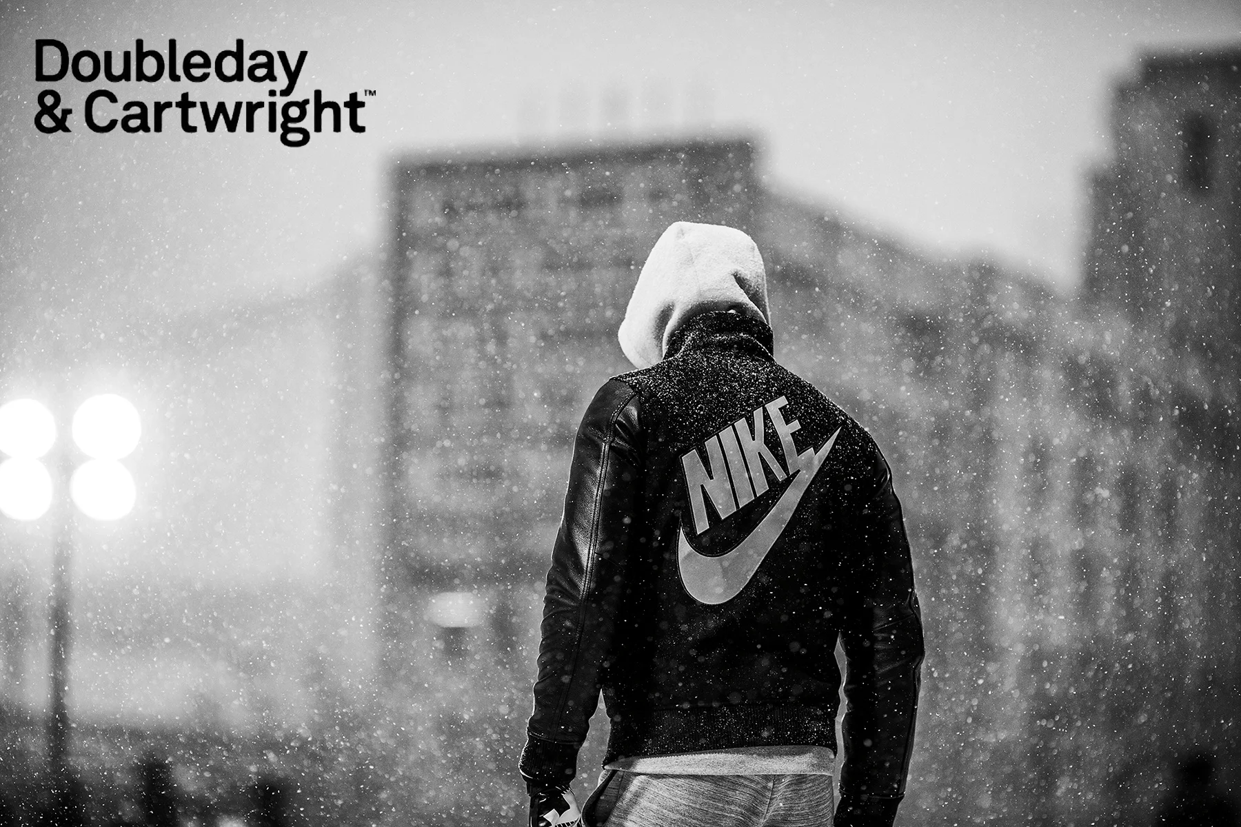
Doubleday & Cartwright is a media and design agency with a specialization in sports and culture.
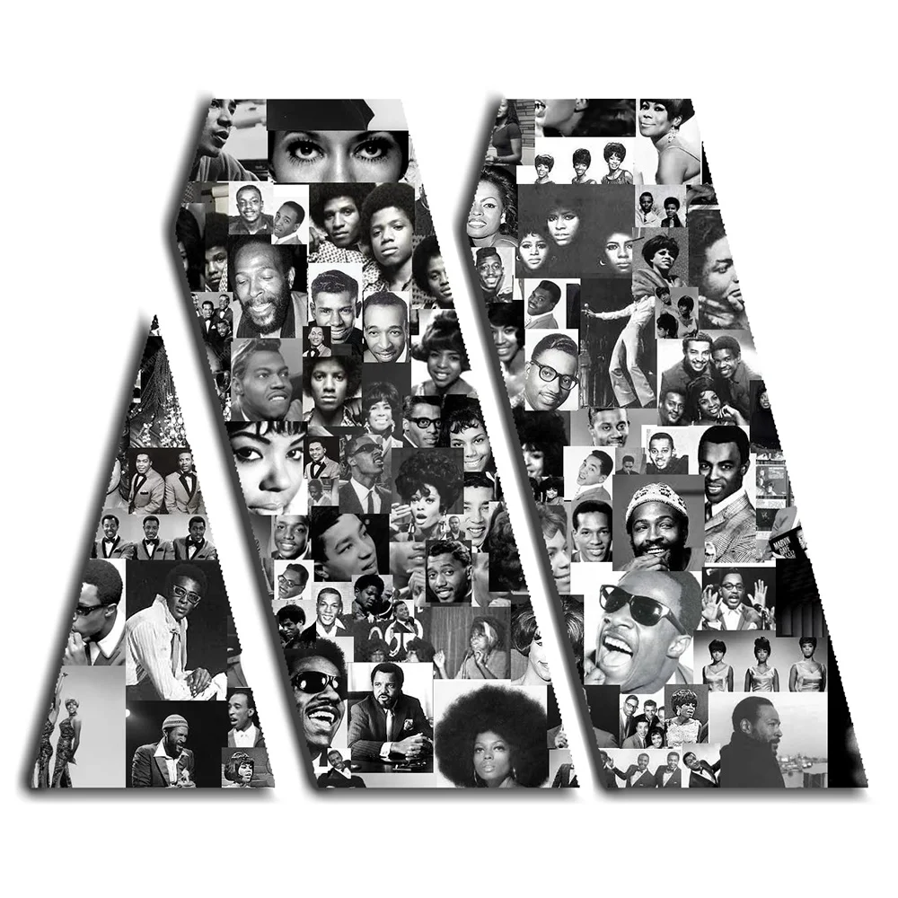
Clients: WHOOP, Motown Records, Firework, Humboldt County
• Ground-up naming explorations, tag lines, and language development
• Copy for digital landing pages, memberships, booking engines
• UX navigation and CTA
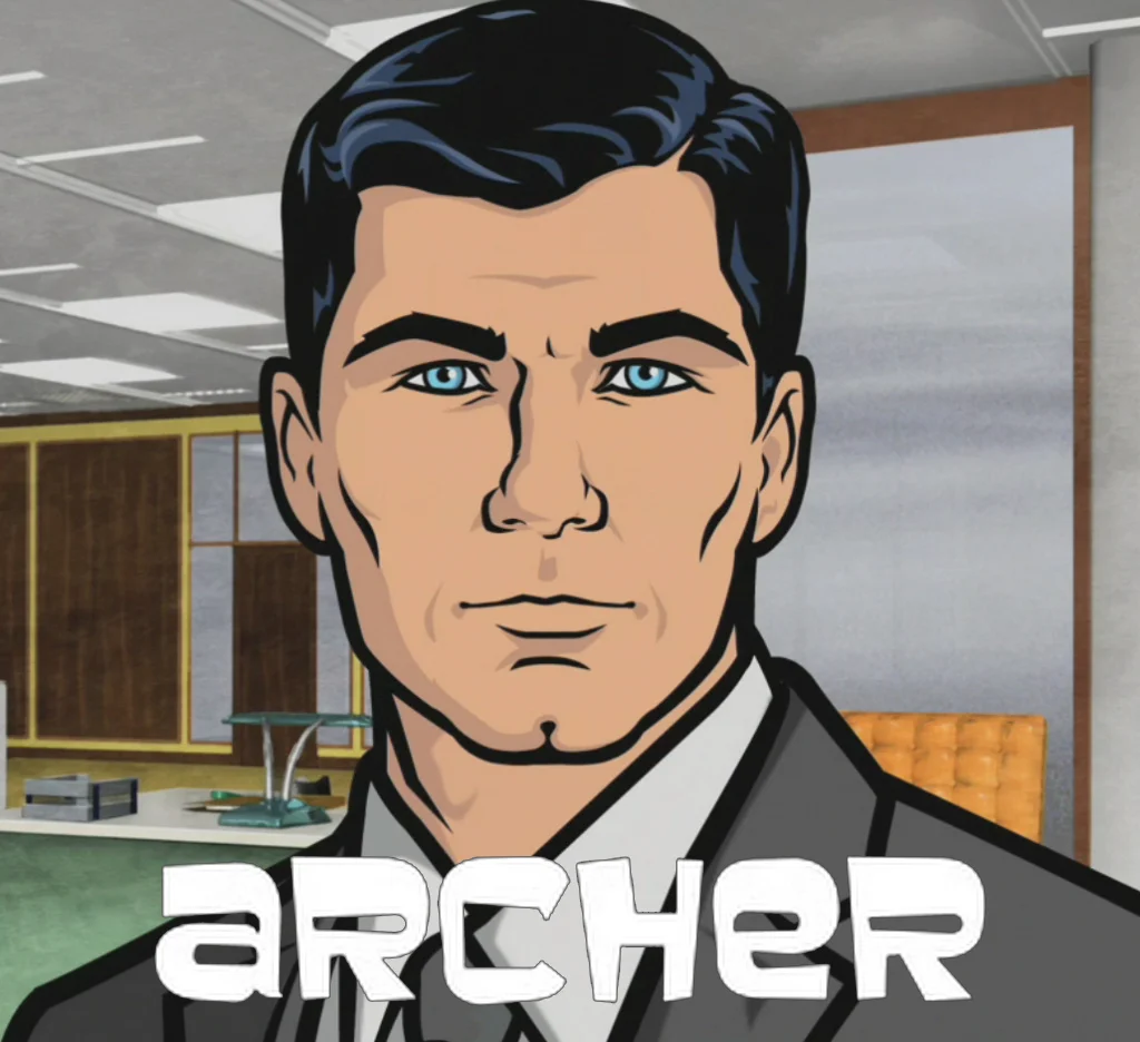
The hilarious and quotable FX series Archer oozes with sexual innuendo, witty banter, and espionage action. These Archer Season 2 promotional banners to do the same. Thanks to the banners, Maxim.com visitors were linked directly to Amazon where they could get their hands on this piece of blue comedy gold.
Deliverable:
• Collaboration with creative team to strategize content for microsite and social platforms
• Development of on-brand copy for web, navigation, social messaging, and marketing promotions
• Partnership with UX team to define user models and interfaces for features
• Participation in usability reviews of site designs to refine content, navigation, and functionality
• Content compliance with corporate standards, web style guides, and legal
Commercial Treatment by Troy Turner (Download here.)
Client: Amazon CA
Direction: Ally Pankiw
Production: Raffi Adlan
My dad was part of the 1968-69 engineering team that trained Buzz Aldrin and Neil Armstrong for their landmark Apollo 11 mission that would see the first humans set foot on the moon. Almost fifty years later, I would help the space pioneer put the finishing touches on a website that would help share his story with the world.
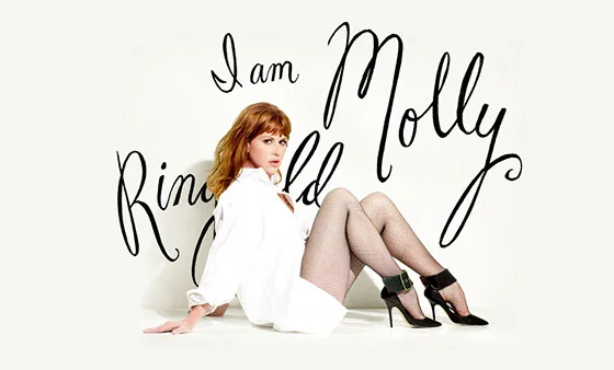
Pop culture icon, Molly Ringwald, was ready to take her look full circle with the launch of her new official site and blog.
The site takes a break from her past and portrays Molly's true nature in this day and age. With a highly-anticipated book release in the works, the agency had limited time to create Molly's modernized new look.
The site’s rich front end and Wordpress backend called for minimalistic yet functional copy that would form a foundation for the multitalented actor/author’s to update her blog on the go. A variety of effective CTAs and one-of-a-kind navigation exist alongside eye-catching full-screen photos to encourage visitors and fans to explore.
Sometimes people give me toys and then I tell everyone what I think about them.
OnTheGrid.City is a collection of neighborhood guides lovingly curated by local creatives in cities around the world.
Specifically, they look to advertising agencies to provide creative insight into the undiscovered, underground hot spots visitors wouldn’t find on an average travel site.
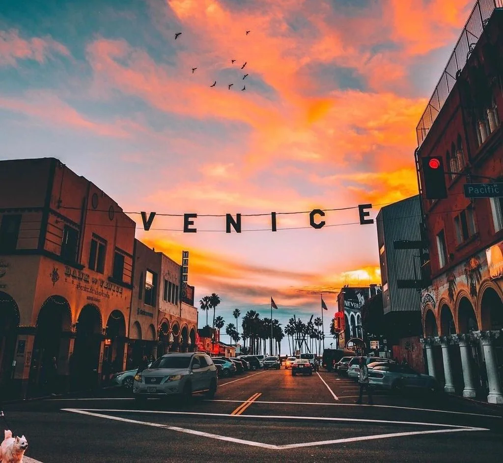
Here long before Google took over Gehry’s Binoculars Building, the agency I worked for was chosen to represent Dogtown. TBF put me up to the task of representing the agency.
As a veteran Venetian, I was thrilled to highlight 25 of my favorite local businesses that were present before Silicon Beach was even a thing. I captured original photography and wrote compelling copy about the importance of each location in Venice’s changing business landscape. I’m proud to have lent a helping hand these businesses, many of which have struggled to stay afloat during the neighborhood’s rapid tech expansion.
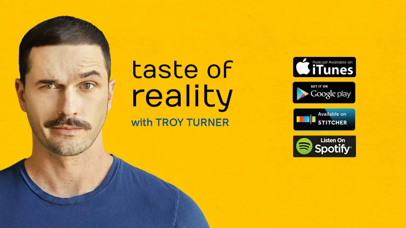
Truth be told, I never much imagined myself as a podcaster or familiar personality. However, after kicking off TasteOfReality.com, it seemed like the natural next step. Think of it as a passion project for my passion project. As it turns out, I’m not half bad at it and it has quickly climbed the ranks of iTunes top TV & Film podcasts.
In addition to licensing the music and executing the visual content to promote the show, each week, I organize, schedule, script, record, edit, and distribute episodes with a variety of content ranging from entertainment news, celebrity guest interviews, comedic show recaps, giveaways, and more.
Give it a listen (just make sure the kids aren’t around!).